National wholesale insurance broker, RPS, was looking to refresh their overall brand to better illustrate the kinds of insurance they help to place—insurance that covers unique, never-been-done-before business risks that aren’t typically addressed by conventional plans. They brought us in to evaluate their strategic positioning, update the overall look and feel, refresh the logo design, and re-examine the messaging architecture and brand voice, as well.
This new brand expression would be centered on their brand promise: “Helping you come through for your clients.” The RPS team wanted this fresh take on their brand to emphasize bold, contemporary colors, to focus on real people in their everyday environments, and to offer a brand look that differentiated itself within the relatively bland wholesale insurance space.
To that end, we helped them craft an updated positioning, developed completely new brand guidelines, showcased the new brand look in a national campaign that featured in-market ads, and created a video that featured the refreshed look and feel and visually related the new brand positioning.

IDENTITY REFRESH
Refreshing a brand identity can involve many elements. To create a brand look that visually aligned with the new RPS brand strategy, we started by updating their logo, revising their font library, and establishing a bold, energetic color palette.
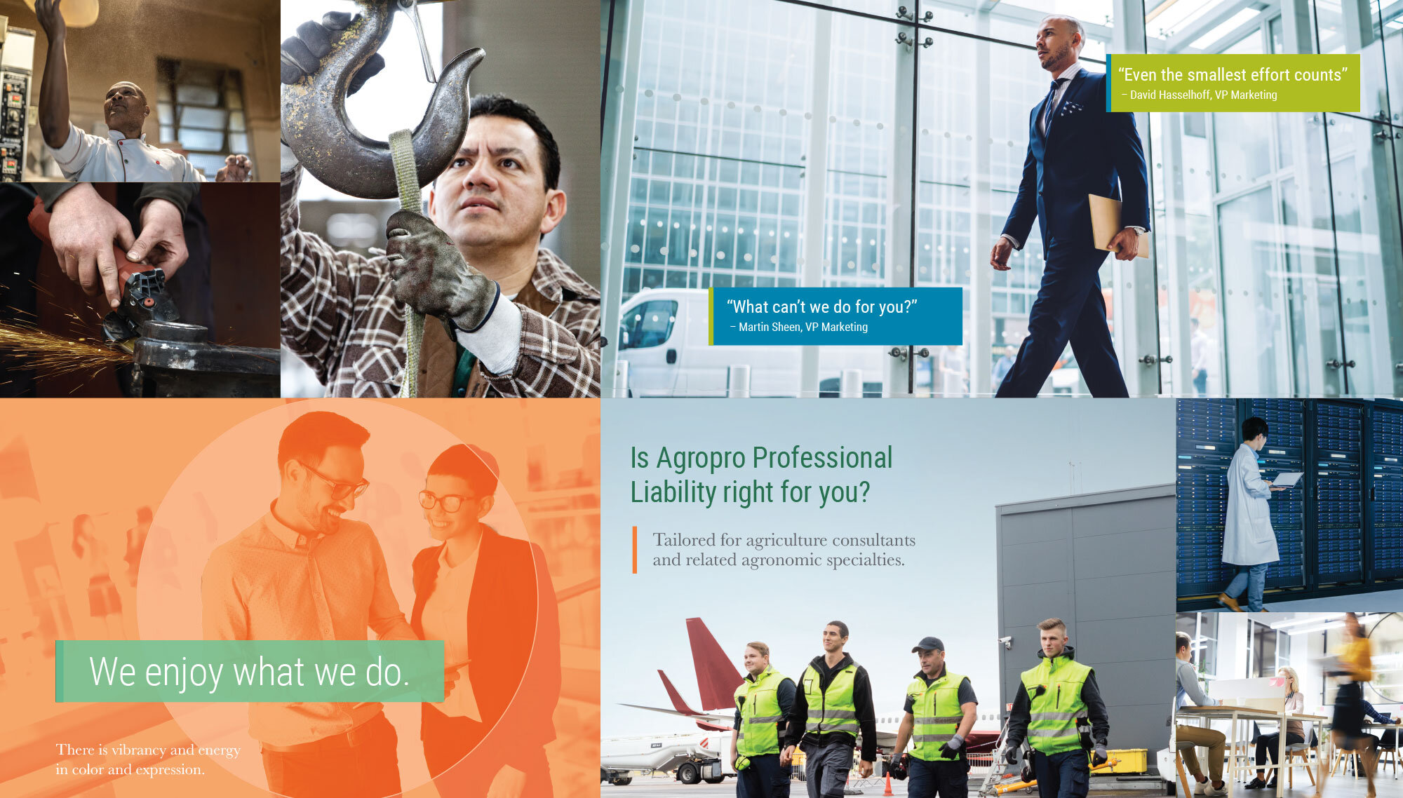
We also carried the new strategy through their photography to better portray the relationships between their agents, clients and partners. From collateral pieces to digital ads and social media, their imagery features authentic people with easy expressions, a bright, approachable look, and an engaging sense of motion.
MESSAGING REFRESH
With respect to their messaging, we performed a deep-dive evaluation to validate and challenge their position within the wholesale insurance space. A big part of the RPS brand is how they tell their story. So, working closely with the RPS team, we provided recommendations for how RPS might craft the brand voice to distinguish it from competition, while maintaining the true character and personality of the RPS culture. Then, we redefined and standardized their messaging architecture to deliver a fresh, cohesive brand message. At every touchpoint, whether it’s a national ad, a phone call, or an elevator pitch, RPS delivers their words in harmony with their brand strategy.
BRAND GUIDELINES
Once we had established the overarching graphic and messaging architecture, we created and distributed a dedicated Brand Guidelines document. From acceptable logo usage to color and typography applications, the Brand Guideline informs the proper creative employment of every new element as it relates to the refreshed brand. The document also includes guidelines for photography style, messaging architecture, icons and graphic devices, and provides examples of correct usage for each.

BRAND VIDEO
In today’s broadband media world, video marketing can no longer be just one piece of an overall plan, it should be a central element of any marketing strategy. To help introduce the RPS brand story to their external audiences in an engaging way, we created an in-market campaign video that visually integrated with the refreshed look and feel. The video featured authentic portrayals of agents, partners and clients, and emphasized the desired brightness and motion qualities of the new brand strategy.
ADVERTISING
With the updated brand in place, RPS launched a new national ad campaign. Based on competitive research and strategic positioning, the campaign focused on showing actual risks that RPS addresses and policies they had placed, primarily those that were unique and one-of-a-kind in nature. With consistent messaging and a contemporary style, the campaign was the first place that external audiences saw the updated RPS brand, and it succeeded in creating the desired marketplace differentiation.


TRADESHOW GRAPHICS
One way to test the impact of a brand look and feel is create pieces in large format. For RPS, we brought the new brand to life with full-size tradeshow wall graphics, stand-ups, and booth furnishings. By faithfully integrating new brand graphic elements, typography and photography into a walkable brand experience, we created an engaging and immersive RPS environment for tradeshow visitors.

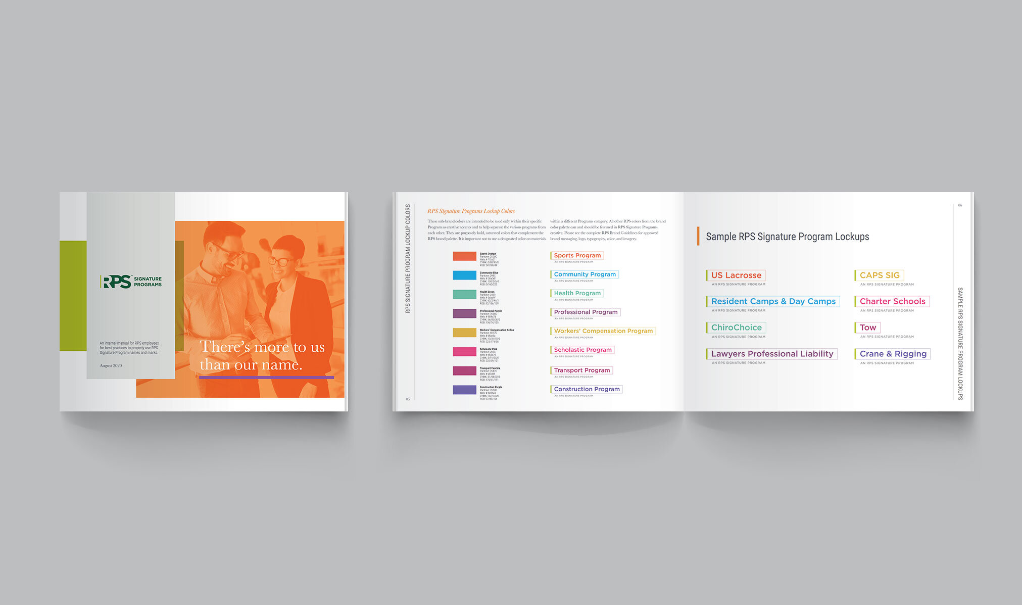
RPS SIGNATURE PROGRAMS
RPS Signature Programs are specialized coverage plans designed to protect businesses exposed to unique risks. For these, our goal was to underscore RPS’s expertise in each of the many program areas. For the programs’ lock-up mark, we developed a customized identity system with color palette designations for each area. This approach was then integrated across all Signature Program touchpoints.