
For Artex, the world’s third-largest insurance manager and a market pioneer in (re)insurance and alternative risk management solutions, finding a better way for their clients takes a mix of both science and art. The scientific part is their ability to decipher a multitude of data, evaluate the marketplace, and precisely identify their clients’ particular needs. The art aspect is taking that knowledge and thinking in creative ways to develop previously unimagined solutions.
In late 2019, Artex asked us to perform a brand refresh to better articulate their core values and highlight their unique approach to helping clients find a better way. To accomplish this, we employed our three-phased rebranding process: Perform an in-depth brand audit, evaluate and modify the brand strategy, and execute an integrated brand update across all client touch points. (To learn more about this approach, visit: brand33.com/process.)
DISCOVERY
We began with an in-depth brand audit to help gain a thorough and intimate understanding of the Artex brand perceptions, overarching market truths, and company aspirations surrounding the brand from a wide variety of audience perspectives. We conducted multiple interviews, both in Artex offices around the globe, and external client interviews across the business spectrum. We then analyzed and synthesized our findings into a formal report and presentation that provided a clear picture of the incumbent brand and laid the foundation for the second phase of the rebranding project.
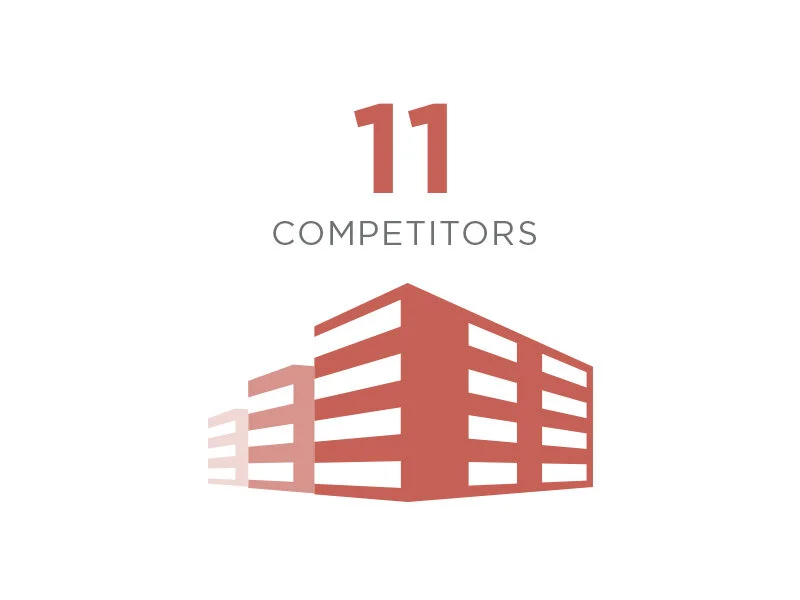
11 COMPETITORS DEEPLY ANALYZED
We always do our homework first. Step one was conducting a comprehensive strategic and creative audit of a pre-approved list of Artex competitors. This auditing and analysis painted a clear picture of their competitive landscape that was important to reference later in their brand development.

19 IN-DEPTH INTERVIEWS
To better understand the current brand perceptions, competitive differentiation opportunities, and future brand direction, we interviewed 19 individuals who touch the Artex brand. This group spanned internal and external audience groups: Artex employees, prospects and clients, and former prospects and clients. The selection was globally representative of the company’s footprint, spanning four countries and several time zones.

17,437 WORDS TRANSCRIBED, ANALYZED, AND SYNTHESIZED
The method of data collection was In-Depth Interviews (IDI’s). After transcribing each conversation, we analyzed and synthesized all of the interviewee responses, which left us with thousands of words to organize, trends to identify, and insights to knit together for the brand.

6.7 HOURS OF RECORDED BRAND CONTENT
In analyzing and synthesizing the data, we often referred back to our initial conversations with respondents. These added up to nearly 7 hours of important brand content that needed to be contextualized and formatted into brand recommendations.
DEVELOPMENT
For Phase Two, armed with our learnings from the Phase One research, we led workshops with the client to develop a clear Artex brand purpose. The concept we agreed clearly expressed the Artex purpose was: “We believe in finding you a better way.” This idea was chosen because we believe it is relevant to both internal and external audiences. It became the brand foundation and informed a series of additional documents that helped define the refresh proposal. Those documents included a brand positioning statement, a compelling brand story, a variety of messaging maps, and complete messaging architecture.
DELIVERY
Finally, in Phase Three, we leveraged the finalized brand documents to guide the refresh execution, in both look and feel, as well as voice and tone. In total, we developed an updated logo, curated a vibrant new color palette, elevated the typography, established a distinctive photography style, further defined the messaging architecture, designed a unique graphic elements system, and outlined the correct application for all in a complete Artex Brand Guideline.
IDENTITY REFRESH
Our first task was to update the ID system. Their existing logo had built up a fair amount of brand equity over the years, so a dramatic change would probably not serve the brand well. However, we felt that the logo could be a little bolder, which would help its readability, especially in smaller applications. While we retained the same brand colors, we chose a heavier font from the same typographic family. We also overlapped the two halves of the letter “x” to add interest and dimension. The update helped give the brand a familiar, yet more striking and contemporary feel.
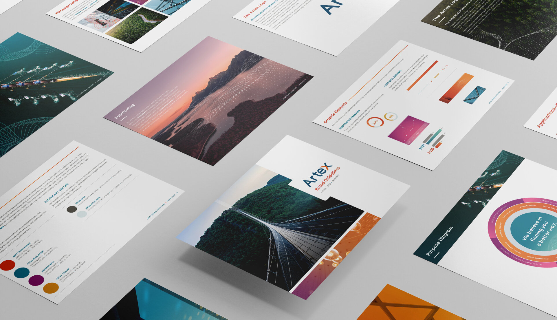
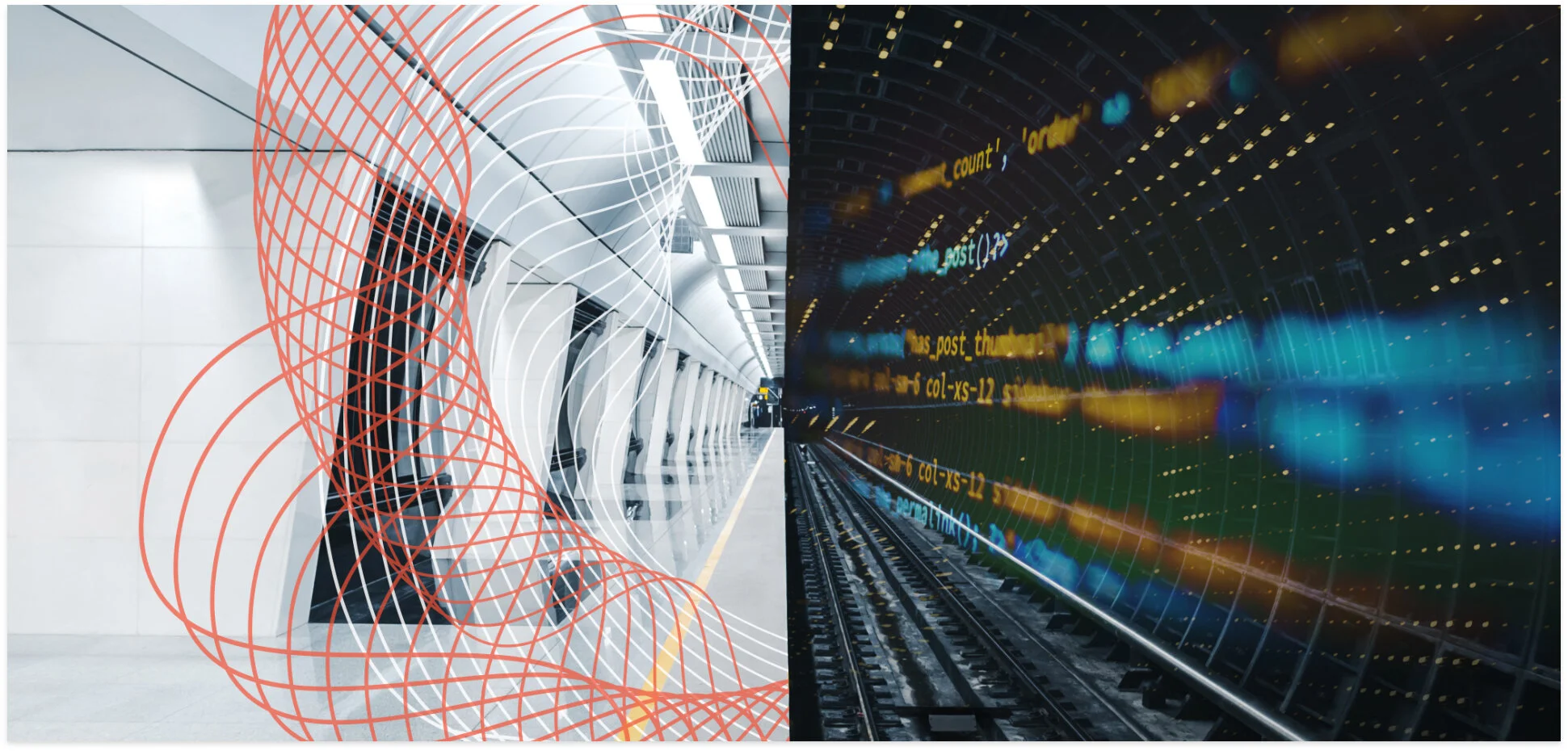
BRAND GUIDELINES - EXPRESSING THE MIX OF ART AND SCIENCE
To help communicate the Artex blend of art and science within the Artex Brand Guidelines, we established specific treatments for the imagery and the graphics. With the photography, we produced imagery that featured dramatic perspectives and included both natural and manmade objects. The images, as well as the design treatments, use vibrant colors, and are overlaid with two distinct graphic patterns that add motion and imply visual data taking form. The two overlays represent both sides of the equation, with the dot pattern representing science and technology, and the organic line pattern representing the art aspect.

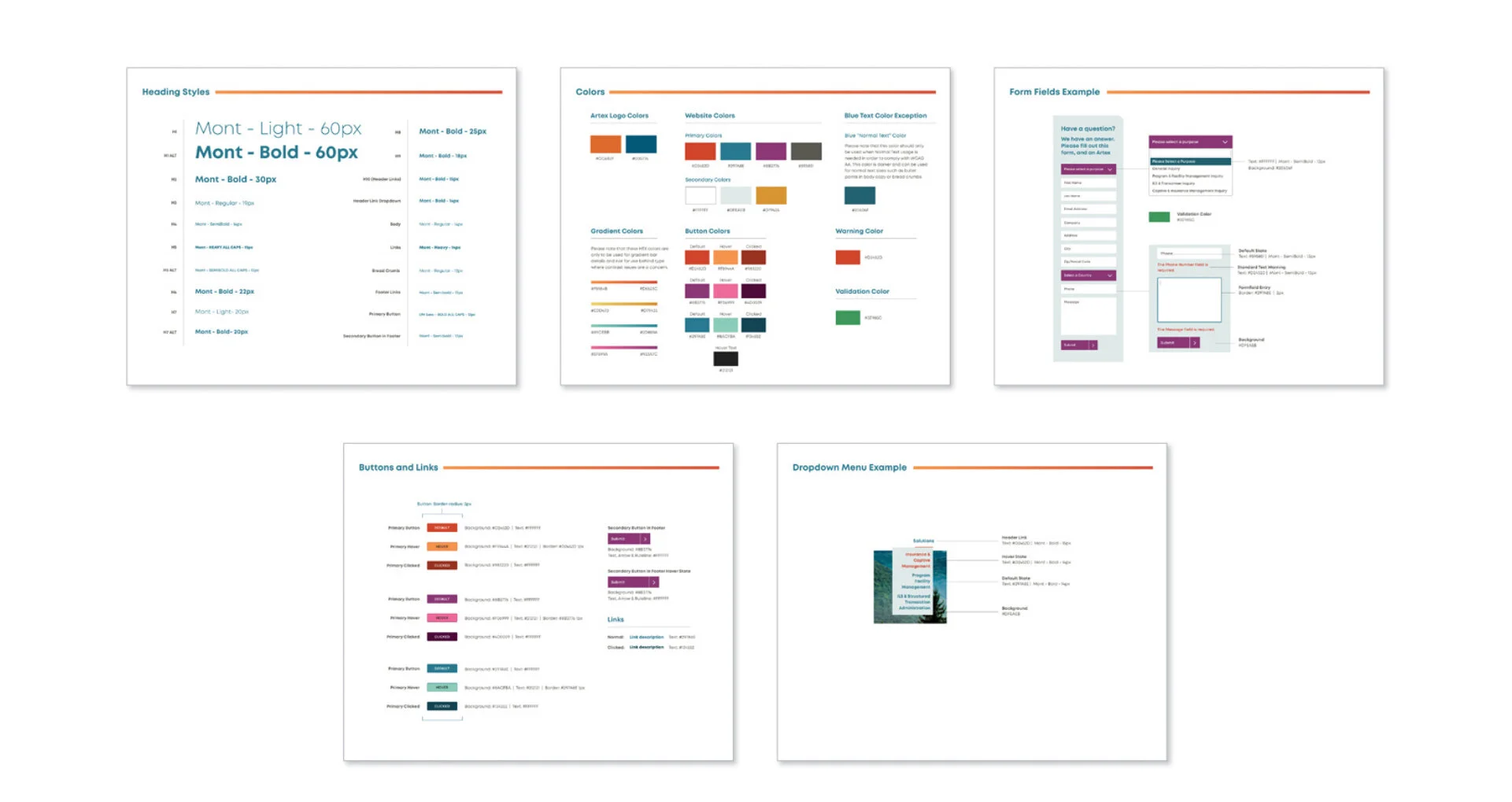
WEBSITE REFRESH AND GRAPHIC STANDARDS
In addition to the Brand Guidelines, we were asked to refresh the existing Artex website, and develop a set of graphic standards to help facilitate the design process for online applications. Informed by the new Guidelines, we updated a variety of elements, such as headers, colors, buttons, dropdown menus, and form fields.


THE ARTEX BRAND APPLIED
Below are examples of the refreshed brand in practice. They include an Artex Information Sheet and an e-blast. We designed the brand look and feel to evolve easily and lend itself to other asset needs. These contrasting examples show the versatility of the updated brand, and how it can be integrated seamlessly with both collateral and digital assets. They look related, but also feel fresh and distinct from each other.

